
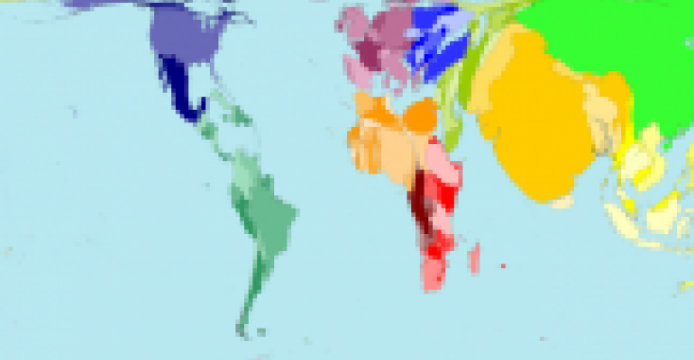
At the Global Alliance for Medical Education meeting in Montreal this week, GAME president Paul Piché, President, HIT Global Inc., used the coolest app I've ever seen to illustrate the demographics of disease and healthcare in the world: www.worldmapper.org/. Here are two of the examples from the site, illustrating the distribution of the world's population today (top) and 2,000 years ago (bottom):


It really brought the data home in a way I hadn't seen before, and it looks really easy to use. From an attendee perspective, two huge thumbs up.
0 comments
Hide comments