
In a world saturated with conferences, don’t just slap a logo on your event. Instead, make it strategic and thoughtful. “It’s always worth the effort,” says Kate Silva, former design director at Freeman XP and now self-employed brand strategist. A well-designed conference logo offers the first glimpse into what an attendee can expect from the live experience and helps maintain connections over time. It should be given the same consideration as every other touchpoint of your brand.
“The logo is out there in the world for all to see and experience. Invest the time. Do it right,” says Silva. But what is the right process for designing a conference logo that will reflect your brand and be remembered?
From the concept stage, to the final product, every agency has its own process, and it is rarely linear. An important first step is partnering with someone who has a shared vision. Silva suggests using an agency that utilizes “Design Thinking,” a customer-centered process to inform the development of the design that gathers “key strategic insights, develops customer segments, creates a message hierarchy, and ultimately a creative brief.” Initial steps, says Sarah Klimek, senior account director at One10, “include a discovery meeting to survey the need, purpose, and cost-benefit analysis.”
Here are four steps to expect when working with a design professional to create your event logo.
• Creative brief. An effective creative brief is the single most critical factor to ensuring a successful project. It should focus primarily on the business objectives of the project, allowing the planner and the designer to clarify exactly what is to be achieved before any work starts. It’s the roadmap for everything that follows.
• Design and conceptualization. There should be an open line of communication between the planner and designer, with frequent updates detailing the progress of the design.
• Feedback. The designer revises the concepts and designs based on the planner’s feedback.
• Final approval and delivery. Both parties sign off on the design and the designer delivers the final creative assets.
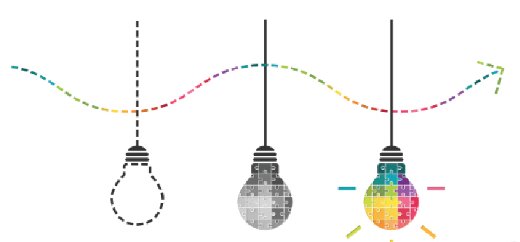
What Makes a Great Logo?
Of all the factors that go into a great logo design, one rises to the top, “simplicity.” The conference name should be clean and easily legible. “Don’t clutter it with all the details. Location. Venue. Dates. That’s what invitations and websites are for,” says Silva.
“The most successful logos are simple graphics that complement the corporate logo and brand,” agrees Joan Parker, senior director, creatice at One10. “They look like they naturally derive from the same visual vocabulary and graphically fit inside the corporate umbrella brand. They can easily take center stage or take the back seat based on how they are being used.”
Silva points to the logo for Salesforce.com’s Dreamforce event as one of her favorites. “There’s a clear connection with the Salesforce brand,” she says. “The logo is clean, simple and iconic.”
Parker believes any event logo should evoke a feeling of “I want to go there and participate!” From a practical standpoint, however, versatility is also important. “The logo needs to work when used in very small or very large formats … and many sizes in between. This is so it can be used to convey the identity of an event or conference on signs, mobile app screens, emails, menus, T-shirts, and more. For this reason also, simple is best,” says Parker.
 One mistake clients make, says Parker, is thinking that the name of the event, location, and dates must be part of the logo. “We think of the logo is a graphic identifier,” she explains, with the copy that accompanies the logo treated as support. “We try to first create a graphic that can be used on its own, then a second version that includes the event/conference name (which will often be used the most), and then one that includes necessary details such as dates and location to be used when appropriate.”
Change or Revise?
Design and marketing professionals argue strongly for maintaining a conference logo from year to year. “Consistency allows your audience to form connections and memories around your event,” Silva explains. “Changing a conference logo each year suggests confusion around your brand. Connections are not formed. Expectations are lost.”
That doesn’t mean nothing can or should change. Silva tells the story of a Fortune 50 technology company that rolled out a new overall corporate design scheme, which necessitated a logo refresh for its event. “The event was a recurring event—so rather than a dramatic redesign, which would have risked jeopardizing existing brand loyalties, we opted to refresh and reflect the new brand framework. We updated the color palette; streamlined and simplified the iconography; created more balance and symmetry and aligned typography. The logo was still easily recognizable, but more closely aligned with the overall brand.”
One way to keep a logo consistent but fresh is with a theme logo, says Silva. “Overall the conference logo remains the same so the brand connection is maintained, but a theme logo is developed for that year.” This approach is useful “to highlight larger corporate initiatives or a strategic focus within the company,” she says. The Professional Convention Management Association uses this approach for its annual Convening Leaders conference by incorporating an iconic piece of the host-city skyline into the logo each year.
While consistency is the goal, there are times when a new or radically updated logo is required:
• The logo is dated. Is your color scheme or typography showing its age?
• The logo has technical issues. If it isn’t readable when scaled or doesn’t translate to black and white, it may be time for a change.
• The logo is forgettable. If the design is complicated, it won’t be memorable.
Building a new logo for your event is an exciting and impactful process. As Aimia’s Klimek says, “conference logos bring cohesion to the purpose of the event, rally attendees around a common message or theme, and serve as a beacon.” Give it the attention it deserves.
This article was updated in September 2023.


