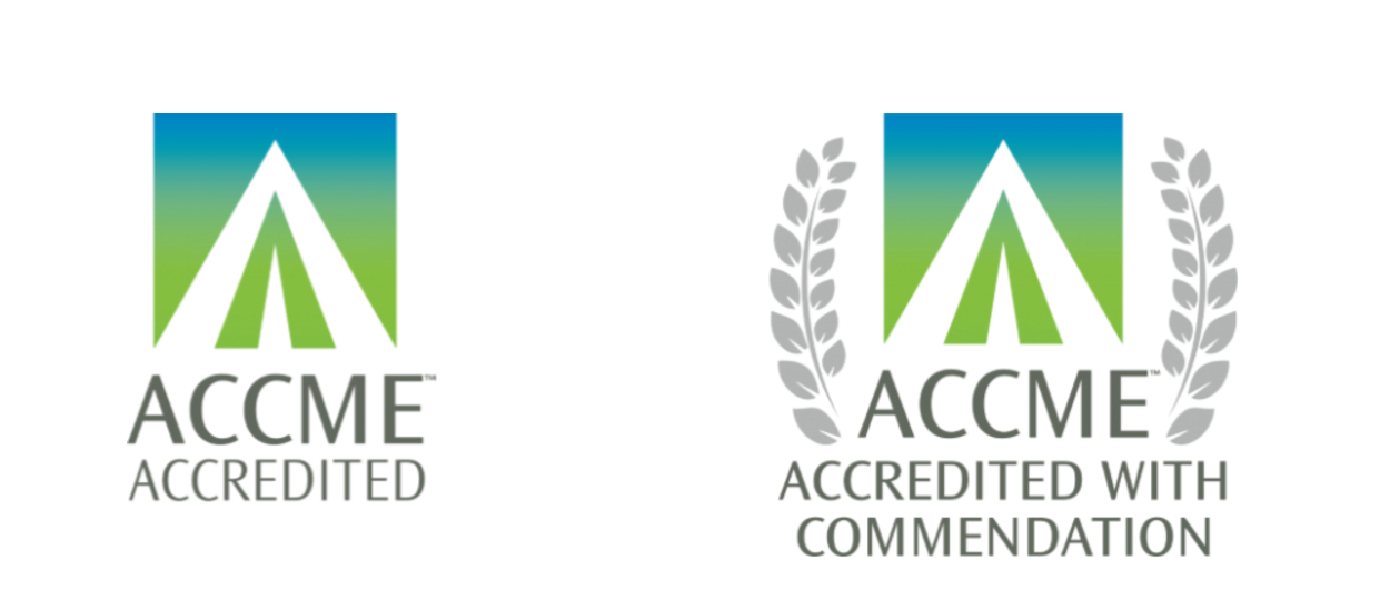
The Accreditation Council for Continuing Medical Education has launched a new logo, tagline, and color palette, along with new marks CME providers can use to communicate their accreditation status. According to the ACCME, the logo’s arrow-like shape is intended to suggest upward movement and expansion, while “its clean lines reflect the precision and accuracy of accreditation, built on the ACCME’s solid foundation. The colors were chosen to show growth and a nurturing environment for education,” the accreditor explains in a press release.
The new tagline, “learn well,” is designed to highlight the ACCME’s evolving role, which now includes coach as well as regulator as it seeks to support, inspire, and motivate the CME community to reach its full potential.
“Our new logo and tagline capture the role of learning in promoting wellness for all of us. As a physician and CEO of the ACCME, I’m optimistic and excited about our future, as we work together to expand the flexibility, inclusiveness, and diversity of education— with the aim of improving care for the patients and communities we all serve,” says ACCME President and CEO Graham McMahon, MD, MMSc.
The new provider marks—the use of which is optional—also are splashed with the spring-like blue/green/gray colors and clean shapes of the new brand, as is the accreditor’s website. While the look and feel of that website has changed, the content, structure, and functionality has not been altered.